WEBSITE DESIGN REVIEW
Disney Through Dieter Rams’ 10 Principles
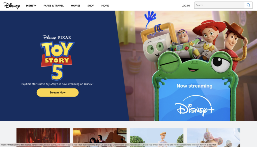
Disney’s homepage uses visual storytelling and promotional content to attract visitors
Introduction
Website Reviewed: https://www.disney.com/
When I think of Disney, I think of creativity, entertainment, and storytelling. Disney is one of the most recognizable entertainment companies in the world, so I was interested in seeing how its website uses design to attract visitors and keep them engaged. For this assignment, I chose to review Disney’s official website using Dieter Rams’ 10 principles of good design, along with the concepts of affordances and limitations from our UX lecture.
10 Principles of Good Design
01
Innovative
I think Disney does a good job of making its website feel modern and engaging. Instead of only using text to share information, the homepage uses large images, promotional sections, and links to movies, streaming services, and theme parks. This makes the website feel more interactive and encourages visitors to explore different types of content. However, I think Disney could make the experience even more innovative by adding more personalized ways for visitors to discover content based on their interests.
02
Useful
Disney’s website is useful because it helps visitors find information about movies, Disney+, merchandise, and vacation experiences. For example, someone interested in planning a Disney vacation can follow links to the theme park websites, while someone interested in entertainment can explore movies and streaming content. I think this is helpful because visitors have different reasons for using the website. One limitation is that users may have to move between several Disney websites to complete certain tasks.
03
Aesthetic
One of Disney’s biggest strengths is its visual appearance. The website uses colorful images, recognizable characters, and promotional graphics to catch visitors’ attention. I think these visuals create excitement and make the website feel consistent with Disney’s brand. The large images also help visitors quickly recognize what is being promoted. However, too many promotional images could make the homepage feel overwhelming, especially for someone who prefers a simpler design.
04
Understandable
I think Disney generally makes it easy for visitors to understand what they can do on the website. Promotional sections include labels and buttons such as “Stream Now,” which clearly communicate the next action. These are examples of affordances because they show users where they can click and what will happen next. However, visitors who are unfamiliar with Disney’s different services might need extra time to figure out which website they should use.
05
Unobtrusive
Disney’s website is designed to attract attention, which makes this principle a little challenging. The large images and promotional sections are visually appealing, but they can also compete for the user’s attention. For example, someone who only wants to find information about a particular movie might become distracted by promotions for streaming services or vacation packages. I think Disney could improve this by balancing its promotional content with simpler navigation options.
06
Honest
I think Disney generally does a good job of communicating what visitors can expect from its content. Movie promotions and streaming sections identify the entertainment being advertised, while vacation promotions provide links to additional details. However, I believe pricing, subscription requirements, and promotional restrictions should always be easy to find. This would help users make informed decisions without feeling confused or misled.
07
Long-lasting
Disney has a strong visual identity that people have recognized for generations. Its logo, characters, and storytelling approach make the website feel familiar even when the featured content changes. I think this is an example of long-lasting design because Disney does not have to completely change its identity every time a new movie or product is released. The company can update its website while still maintaining a recognizable appearance.
08
Detailed
Disney pays attention to visual details such as images, headings, promotional sections, and branding. The website organizes different types of entertainment into sections, helping visitors understand what they are looking at. However, I think attention to detail should also include accessibility. For example, readable text, appropriate color contrast, keyboard navigation, and alternative text for images are important for making the website usable for everyone. These features would need to be tested before determining how accessible the entire website is.
09
Eco-friendly
This principle is harder to evaluate just by looking at a website because environmental impact is not always visible. Websites require energy for hosting, loading images, and delivering videos. Since Disney uses many high-quality visuals, I think optimizing image sizes and reducing unnecessary loading could help make the website more efficient. This could also improve loading speeds for visitors using slower internet connections.
10
Minimal
I think this is one area where Disney could improve. The homepage contains many promotions for different products and experiences. While these are useful for marketing, they can make it harder for visitors to focus on one task. I think a simpler homepage with fewer competing promotions could make navigation more efficient. At the same time, Disney needs to maintain its creative and entertaining brand identity, so the challenge is finding the right balance.
UX Analysis: Affordances & Limitations
What Works Well
One thing I like about Disney’s website is how it uses recognizable characters, colorful images, and clear buttons to help visitors navigate. For example, the “Stream Now” button on the Toy Story 5 promotion makes it obvious where users should click if they want to watch the movie. This is a good example of an affordance because users can understand what the button does without needing instructions. I also think Disney’s branding makes the website feel familiar and welcoming, which encourages visitors to explore more content.
What Could Improve
Even though Disney’s website is visually appealing, I think it can sometimes feel a little overwhelming because there are so many promotions and different services. For example, visitors might see links to Disney+, movies, merchandise, and theme parks all in one place. Someone who only wants to find a particular movie might get distracted by other content. I think Disney could improve the user experience by simplifying some sections and making navigation between its services more consistent.
Final Thoughts
Overall, I think Disney’s website provides a good user experience because it is visually appealing, engaging, and consistent with its brand identity. Its strongest areas are aesthetic design, recognizable branding, and useful affordances that encourage visitors to explore content.
However, I think the website could improve by reducing visual clutter, simplifying navigation between services, and making accessibility and performance a priority.
After reviewing Disney’s website using Dieter Rams’ principles, I learned that good web design is not just about making a website look attractive. It is also about helping people understand how to use it without confusion. A successful website should balance creativity, usefulness, simplicity, and accessibility so that visitors can focus on what they came to do.